Typography as a Tool for Emotion
Serif, grotesque, slab, or variable font? How to choose a typeface for your brand, read licenses correctly, check Czech diacritics, and decide how many fonts you really need.
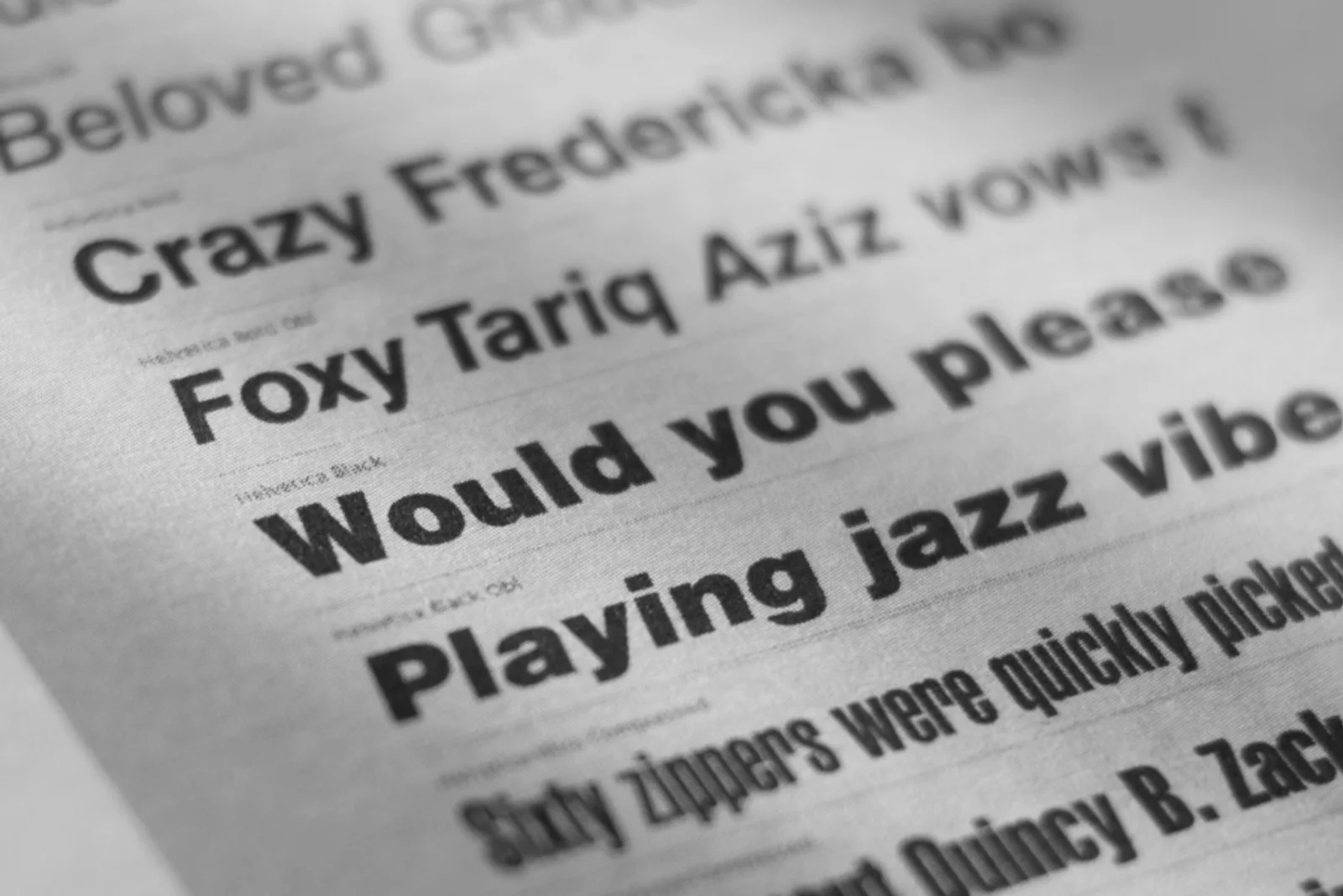
Type is the one part of a brand identity that shows up in everything a company sends out, from an invoice to a package. Most companies need only one or two families, as long as they offer enough weights, complete Czech diacritics, and a license owned by the company rather than by a supplier. Last updated: November 2026.
You are choosing a typeface for a brand, you have been through twenty samples, and they all look the same. What is missing is a set of criteria you can decide by, plus some certainty about what you are actually buying when you pay for a license. The guide below is a process you can decide with.
Why does type matter in a brand?
Type matters because it carries the brand's tone of voice before the customer reads a single word. The same sentence set in a thin serif and in a heavy geometric sans serif sends two different messages about what the thing costs and who stands behind it.
The second reason is operational. Type is the most frequently used element of an identity: it appears in a quote, a contract, a sign, a presentation, and an email signature. Color or the logo may never show up on some materials, but text always will.
The third reason is cost. A badly chosen typeface shows its price later, usually when you need to set a price list, translate the site into another language, or hand files to a supplier. Rebuilding the typography of a brand that is already running costs far more than one extra hour spent choosing.
What is the difference between a serif, a sans serif, a grotesque, and a slab?
The difference is in the serifs and in the drawing: a serif typeface has small finishing strokes at the ends of its strokes, a sans serif has none, a grotesque is a subgroup of sans serifs with a neutral drawing, and a slab serif has square, heavy serifs.
A serif typeface is a typeface whose strokes end in a serif, a short cross stroke that helps the eye hold the line. We read serifs as traditional, settled, and trustworthy, so they suit brands that sell certainty and experience.
A grotesque is a sans serif with fairly even stroke weight and a restrained, technical drawing without ornament. It reads as neutral and matter of fact, lets the content lead, and holds up well at small sizes on screen.
A slab serif has serifs that are square and as heavy as the strokes themselves. The result is a sense of strength and durability that fits industries where people work with their hands and with machines. Alongside these three groups there are geometric sans serifs built on the circle and the square, scripts that imitate handwriting, and display typefaces drawn for large sizes.
For Czech brands it pays to look at local foundries as well, for example Suitcase Type Foundry or Briefcase Type Foundry. Their typefaces have diacritics solved by the designer rather than added afterwards, and you will see the difference in any word where ď, ť, and a capital Ř meet.
What are variable fonts and why do they matter in 2026?
A variable font is a single font file that carries a continuous range of variations, so instead of ten separate weights you work with one file and set weight, width, or slant as a numeric value. Inter, Roboto Flex, and Recursive are available this way today.
- A faster website: the browser downloads one file instead of a whole set, which shows up in load speed and in how the page is rated in search.
- More precise tuning: you can set a headline exactly between Medium and Semibold instead of settling for whatever the foundry shipped.
- Identity in motion: weight and width can be animated, so a headline or a logotype can respond to screen size or to cursor movement.
- A link to design tokens: type values are written as variables shared between design and code, so a change in the brand flows into the product without manual rewriting.
There is one catch. A license for the variable version usually costs more than the individual weights, and older print shops still struggle with it now and then. Always buy static weights for print as well, and confirm with your printer that they can process them.
Which typeface suits which kind of brand?
A typeface suits a brand when its character matches what the brand promises and it also survives the day to day work it will live in. The overview below lists real families and the industries where they work.
- Garamond: a classic serif with a long history. It suits publishers, cultural institutions, and brands built on tradition and text.
- Tiempos: a contemporary serif drawn for editorial setting. It fits media, consultancies, and premium food brands.
- Helvetica Now: a reworked version of the best known grotesque. It belongs to corporate brands, transit, and anywhere the content should speak instead of the type.
- Söhne: a grotesque with a slightly warmer drawing. It serves studios, creative agencies, and services that want to look professional but not cold.
- Inter: a sans serif drawn specifically for screens and available as a variable font. It suits software products, apps, and interfaces.
- Futura: a geometric sans serif built on the circle. It fits architecture, design, and lifestyle brands, and it handles long paragraphs less well.
- Roboto Slab: an angular slab serif available under an open license. It works in construction, engineering, and sports brands.
- JetBrains Mono: a monospaced typeface for code and data. It is used by developer products, data portals, and tables where numbers need to line up.
Always test your choice on your own content. A typeface that looks great on a foundry's specimen page can fall apart on your longest product name or in your densest price list.
How many weights does a brand need?
Most brands need four to six weights: Regular, Medium or Semibold, Bold, and an italic, plus Light for large headlines. A weight is one specific variant of a family, for example Light, Regular, Bold, or italic, with the same drawing but a different thickness or slant.
Fewer weights mean a cheaper license and simpler rules, but you will hit the limit sooner. Without an italic, quotations and titles are hard to set, and without a middle weight, subheads are hard to tell apart from body text. A family with twenty weights, on the other hand, helps nobody unless the guidelines say when to use which.
For office use you also need a system fallback, a typeface that every computer in the company already has. Word, Google Docs, email templates, and colleagues' presentations are places where a licensed typeface often cannot be installed, and without a designated alternative everyone solves it their own way.
How is a typeface chosen in a real project?
A typeface is not chosen by taste but by the brief and by testing on real content. At Slant the selection has six steps.
- Brief and positioning: first we establish how the brand should come across and who it speaks to. That gives us a handful of adjectives to decide by, for example solid and clear versus playful and accessible.
- Typographic research: we prepare three directions, not thirty. Each one has a different tone and is shown on the same content so they can be compared.
- Testing the worst case: we take the longest product name, the densest price list, and the smallest mandatory text on the packaging. Whatever survives that will survive everything else.
- Checking diacritics and languages: we set real Czech text and check how the carons, acutes, and the ring are drawn, on capitals in particular. If the brand is heading abroad, we review the other language sets too.
- Technical and licensing audit: we count the licenses needed for desktop, web, and apps, and verify whether the agreement allows use in a logo.
- Writing it into the brand guidelines: we record the choice as a typographic system with a size scale, line spacing, and usage rules, and for digital projects straight away as design tokens.
How does font licensing work and what should you watch out for?
When you pay for a typeface you are not buying a file, you are buying a license for a specific kind of use, and that license differs for desktop, web, and apps. Disputes mostly start when a company buys one license and then uses the typeface everywhere.
- A desktop license is counted per workstation or per user. Five people in marketing means five licenses, not one.
- A web license is usually based on traffic or on monthly page views. When the site grows, the license has to be raised with it.
- An app license and embedding in a product are bought separately. The same goes for ebooks, games, and devices with their own display.
- What to check before you buy: confirm use in a logo, the number of weights in the package, the difference between a subscription and a perpetual license, and whether the phrase free for personal use rules out commercial work. Downloading from unofficial sources exposes you to claims for back payment.
- Why licensing cannot be ignored: foundries now track where their typefaces are used on the web and in print files, and a retroactive settlement tends to cost several times the original purchase.
- Who should hold the license: your company, not the agency or a freelance designer. If the supplier owns the license, you lose it the moment the engagement ends, and you have to send the printer files with the type converted to outlines.
Where did the choice of typeface shape the identity in Slant projects?
In our projects typography often decides the character of an identity before color or the logo does. Three recent cases show how.
Jatvar (2025) is an identity for a family stonemason with a tradition dating back to 1965. A brief like that invites an ornate, “headstone” lettering, but that would lock the brand in the past. So we looked for an expression that keeps the craft’s precision and still feels current. It had to hold up everywhere customers meet Jatvar: in the stone sample book, on the vehicle livery and on the website.
Autojeřáby Malina (2024, mobile crane rental) is a family business with a long history in heavy industry. In a rebrand like this, type has to convey strength and reliability and also work where branding is normally never considered: on a crane cab, on workwear, in a contract, and in a table of technical specifications. Alongside the main typeface we therefore set up a system alternative for office documents.
Halmax (2025) is an agriculture brand that was created together with its new name. Nobody knows a new name yet, so typography has to help people remember it and give it the matter of fact quality the industry expects. Type here is not decoration, it carries clarity across technical documentation and out in the field.
Related reading
If you are dealing with typography as part of a bigger picture, start with What branding is, a complete guide, which describes what a brand is made of and where type belongs in it. The natural follow up to choosing a typeface is Brand guidelines in 2026, which shows how to write typographic rules people can actually work from. And if you are picking a typeface at the same time as the logo, the Logo glossary with its overview of logo types will help.
Frequently asked questions
How many typefaces should a brand use?
Two are enough for most companies: one for headlines and one for text. If a single family has enough weights, one typeface will do. Add a third only when it has a clearly defined job, for example quotations or packaging.
Can I use a Google Fonts typeface for a company brand?
Yes, typefaces under the SIL Open Font License may be used commercially, including in a logo. The upside is zero cost and easy rollout across the company, the downside is less distinctiveness, because thousands of other brands use the same typefaces. A good compromise is a paid headline typeface combined with an open source text face.
How do I know whether a typeface supports Czech?
Check the specification for the Latin Extended A character set and set a test text with ě, š, č, ř, ž, ů, ď, and ť. Check capitals with diacritics as well, because that is where errors surface most often. If the carons look like apostrophes or collide with the ascender line, the typeface does not handle Czech.
How much does a font license cost?
The price depends on the number of weights, the number of workstations, website traffic, and whether you need a license for an app or a logo. The range is wide, from free open source typefaces to individually negotiated agreements with large foundries. Always price the total volume of use, not the cost of a single weight.
Does a logo have to use a different typeface than the rest of the brand?
It does not, but a logotype is usually adjusted typographically so that it is recognizable and cannot simply be retyped on a keyboard. Spacing, serif length, or the shape of a single character are the usual edits. The rest of the identity can then build on the same family, which gives the brand cohesion.
Working on a visual identity and choosing a typeface? Write to us at [email protected]. Send a list of the typefaces you use today and a link to your site, and we will come back with a typographic audit and a recommended next step.