Brand Guidelines in 2026: PDF, Online Portal, or Design Tokens?
PDF, online portal, or design tokens? Company size does not decide it. What matters is how many people use your brand and how often files change, plus what brand guidelines must cover.
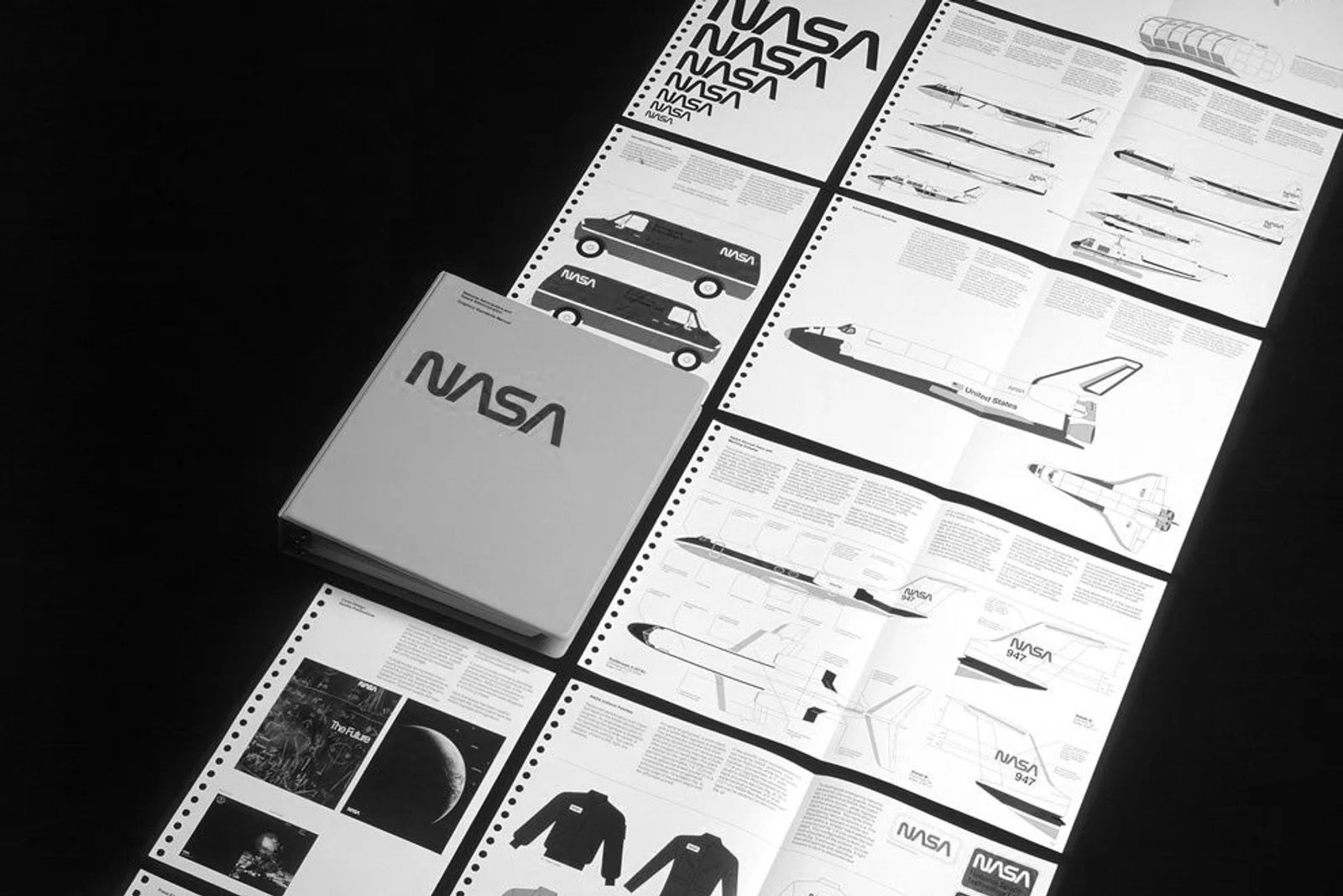
Brand guidelines did not die in 2026, they just stopped being one PDF for everyone. What decides the right format is the number of people who touch the brand every day and how often the files change, not the size of your company or the page count of the document. Last updated: November 2026.
You pay for a new identity, you get a PDF, and six months later nobody in the company can find it. Meanwhile a stranger's typeface creeps into your sales proposals and the logo sits in a white box on a colored background. The problem is not guidelines as such. It is that most guidelines are written for designers instead of for the people who are supposed to use them every day.
What are brand guidelines?
Brand guidelines are a binding description of how a brand may and may not be used, from the logo, colors, and typefaces to imagery, tone of voice, and specific applications. They are not a gallery of pretty mockups. They are an operational document you make decisions from, in the moment someone needs to produce a proposal, a vehicle wrap, or a social post.
In practice they get confused with three other things. Logo guidelines cover the logo only: its variants, clear space, minimum size, and forbidden uses. A design system is a library of ready made components for digital interfaces, used by designers and developers at the same time. The asset library, usually called a DAM, is where the files themselves live: logos, photography, templates, and video.
The difference between them is very practical. Guidelines tell you how it should be done. The asset library hands you the files you do it with. A design system does it for you, because the rule is baked into the component. The more people use the brand, the further the center of gravity moves from description toward automation, and the less sense it makes to buy a nicely typeset document and nothing else.
Is the classic PDF obsolete?
The PDF is not the obsolete part, the belief that a hundred page document will fix brand usage on its own is. As a designer I am happy to print a book like that and stand it on a shelf. As a tool for a client it fails the moment a new person joins the company, a salesperson needs print ready artwork on a Friday night, and nobody knows where the file actually lives.
Guidelines are not dying, their single format is. Guidelines nobody opens are about as useful as a contract nobody signed. You recognize good ones by a single sign: people in the company open them before they ask the designer, and they find most everyday situations within two minutes.
When is a PDF enough, and when is it not?
A PDF is enough when one to three people work with the brand, few materials get produced, and the identity is not going to change for the next six months. In that situation anything more complex is just another system somebody has to maintain, and usually nobody does.
A compact PDF and one shared folder of exports will carry you if most of this is true:
- the brand is handled by the owner, an assistant, and a freelance designer
- you produce a handful of material types, typically a website, business cards, vehicle wraps, and proposals
- print is handled by one supplier who knows the identity
- you have no digital product or app of your own
It stops being enough the moment any of this happens:
- several people produce materials, typically sales, HR, and individual branches
- you work with multiple suppliers and each one keeps its own version of the logo
- the brand has several language versions or sub brands
- the files change several times a year
- developers implement the identity on a website, in an e-shop, or in an app
On a retail project like Velký Špalíček, where tenants, the property manager, and outside suppliers all feed into the communication, the only sensible format is a portal with one link for everyone. The moment two versions of the truth exist in a company, the older one always wins, because somebody already has it half finished in a template.
What is a brand portal and who is it for?
A brand portal is a web application where the brand rules and the downloadable files sit on a single link, always in the current version. The main benefit is not a prettier look. It is that nobody has to guess which folder is the right one, and that pulling an old version off the portal genuinely takes it out of circulation.
The tools differ in purpose, not in which one is better. Frontify makes sense for larger companies with an in house marketing team dealing with access rights, approvals, and a high volume of materials. Zeroheight fits companies with their own digital product, because it keeps the visual rules and the interface components in one place. Notion is the fastest way to get rules online in a company that already works in it, at the cost of weaker file management and a result that looks like internal documentation rather than a piece of the brand.
Never start with the choice of tool, though. First answer how many people will work with the brand, how often the files will change, and who will run the portal once the work with the studio ends. A portal without an owner ages just as fast as a PDF, and you pay a license fee for the privilege. At a company like Halmax, where technical suppliers with no design background also use the files, a file structure people understand matters far more than the feature list of the tool.
What are design tokens and when should you deal with them?
Design tokens are named variables that hold one specific value from the identity, for example a color, a type size, a spacing step, or a corner radius. Instead of a raw color code, the design file and the code both reference a name like color/primary, which points to a single central value.
The practical effect is simple. You change the value in one place and it lands everywhere: in the design tool, on the website, in the app, and in your templates. It ends the situation where the corporate blue has three shades depending on who pulled it from where.
Deal with tokens if at least one of these is true:
- you have your own digital product, app, or a large e-shop
- several developers or several suppliers work on implementing the identity
- you are planning sub brands or multiple color and language variants of the interface
- the identity has a dynamic part that behaves according to context
For a company with a website, print, and vehicle wraps, tokens are extra work with no payoff. A well described palette and precisely prepared files do exactly the same job. On a project like Data JMK, where the deliverable is a data portal and the whole visual system lives inside an interface, tying the identity to the code is precisely what keeps the result consistent years after handover.
What do brand guidelines need to contain at a minimum?
A minimum set of working guidelines has eight parts and fits into twenty pages. Everything beyond that is an extension, and only brands with a lot of applications, locations, or sub brands have earned it.
- Logo and its variants. Primary version, reversed version, one color version, clear space, minimum size, and an overview of forbidden uses.
- Colors. Values for print and for screen, the ratio in which they are used, and rules for contrast and accessibility.
- Typefaces. Primary and secondary typeface, a fallback system font for office documents, and the licensing situation.
- Layout and composition. How a page is built, what the grid is, and how to work with white space.
- Imagery. Which photography and illustration are in and which are out, ideally shown as pairs of examples.
- Tone of voice. How the brand speaks, how its name is written, what it never says, and sample sentences in a say this, not that format.
- Applications. Real examples of what the company actually uses, from a presentation and a proposal to packaging or a vehicle wrap.
- Contact and the path to the files. A name, an email address, and the location of the current export folder. This is missing from an uncomfortable number of guidelines, and it is the first thing a user looks for.
How do you build guidelines a client can actually use?
Guidelines get used when they are written for specific people and specific situations, not for an abstract designer. The process that works for us has six steps.
- Find out who will work with them. A marketing team needs a different document than an operations director who orders a vehicle wrap once a month. Make the list of users before you write the first page.
- Write in the user's language. Your client has no idea what CMYK is and will grab whichever file looks about right. Say outright which file goes to the printer and which one goes into a presentation.
- Draw the line on self service. State clearly what the company can handle itself in a template and when it should pick up the phone. Without that line you get either paralysis or creativity in the wrong place.
- Connect a live export library. One folder with a logical structure and names people understand saves more work than twenty pages of rules. Name things by use, not by file format.
- Hand the guidelines over in person. A short presentation for the team works better than an email with an attachment. Record the session so the person joining a year from now has something to go back to.
- Schedule the review. Once a year, go through what the company is really producing and add the applications that appeared in the meantime. Guidelines without a review drift away from reality within two years.
For brands whose main carrier is packaging, we add one more layer: rules for the entire packaging range, materials included. At Konopný Táta the label is the main surface of the brand, so the guidelines have to cover not just the logo on the label but above all how the range behaves when a new product joins it.
How do guidelines help when you work with AI tools?
Guidelines are now the source of context AI tools pull from when they write your copy or put together your visuals. If the rules are not written down somewhere legible to people and machines alike, the tool has nowhere to get them and will invent them instead, quickly and consistently wrong.
In practice that means three things. Describe tone of voice with example sentences, not with adjectives like modern and friendly, because nothing usable comes out of a brief like that. Keep a list of banned phrasings, the correct spelling of the brand name, and a glossary in plain text you can paste straight into a prompt. And hold colors, typefaces, and spacing in tokens so generated output can inherit them instead of being recolored by hand.
That shifts the role of guidelines. They used to be a control document you consulted once a dispute broke out. Today they are an input to production, and the more precisely they are written, the less time checking the output costs you.
Related reading
For the wider context, read What is branding, which explains how strategy, identity, and communication fit together. Why a good brand is more than a logo answers what you actually get when you commission an identity. And if you are working out which logo variants belong in the guidelines at all, the Logo glossary will help.
Frequently asked questions
What is the difference between logo guidelines and brand guidelines?
Logo guidelines cover the logo only: its variants, clear space, and forbidden uses. Brand guidelines cover the whole brand, including colors, typefaces, imagery, tone of voice, and applications. Logo guidelines are therefore one chapter of brand guidelines, not a cheaper version of them.
How many pages should brand guidelines have?
For most small and midsize companies, a few dozen pages is plenty. Nobody reads a longer document, and real length only makes sense for brands with many applications, locations, or sub brands. What matters more than length is whether a user finds the answer within two minutes.
Is a PDF or an online portal better?
The number of people and the frequency of changes decide it. With one to three users and a stable identity, a PDF is faster and cheaper. As soon as several people are producing materials or the files change a few times a year, a portal pays for itself, because it takes the older logo versions out of circulation.
Does a small company need design tokens?
In most cases, no. They start to make sense when you have your own digital product or when several developers implement the identity. A company with a website, print, and vehicle wraps is fine with a well described palette and properly prepared files.
Who should own the guidelines inside the company?
One specific person with a name and an email address, not a department. They approve exceptions, maintain the current export folder, and decide when a job goes to the designer. Without that role the rules fall apart no matter how well they are written.
Need guidelines your team will actually use? Write to us at [email protected]. We will go through your existing materials and tell you whether a PDF, a portal, or design tokens is the right answer for you.